Communication Research Behind the #knowyourlemons Campaign
Whether you are a doctor in a clinic, a public health director or an activist looking for creative ways to educate those around you about breast cancer, our education campaign is designed for everyone.
We are aware, but we are not educated
According to a 2018 survey of 19,000 women, just 2% of women know all the signs of breast cancer. Only two in five people (42%) are confident about recognising the changes to their breasts that could be a sign of cancer.
90% of those surveyed on our website (n=7688) report that they aren't confident in how to self-exam.
Despite all of the attention on breast cancer awareness, there seems to be awareness of the existence of the disease, but not education relating to how to identify it early through symptoms recognition and screening. This is the sole focus of our organization; finding ways to remove the educational barriers to early detection worldwide.
Why has this problem not improved?
There are three key barriers to talking about breast cancer:

CHALLENGE #1: LITERACY
Most health messages are still communicated through text, often using medical terminology that challenges even the educated patient. In the USA, it’s estimated that 1 in 5 patients have low literacy. On a global scale, literacy is a much bigger problem. To save lives, we need to be able to communicate beyond text.

CHALLENGE #2: TABOO
Because breasts are usually associated with sex, images of them are often censored in public. This makes it difficult to “show” breast cancer to a large audience, especially in certain cultures or settings. To save lives and reach more people, we need to show breasts in a way that can be displayed in public.

CHALLENGE #3: FEAR
Talking about cancer can be scary. Some just don’t want to talk about it. Fear of the unknown can also stop women from telling someone about a symptom during a stage when it can be treated. In developing countries, more than half of women diagnosed with breast cancer are diagnosed as terminal, compared to just 10% in developed countries. To save lives, we need to approach the topic in a more friendly and familiar way.
How do the Lemons work to solve these problems?

SOLUTION #1: VISUALLY EXPLAIN
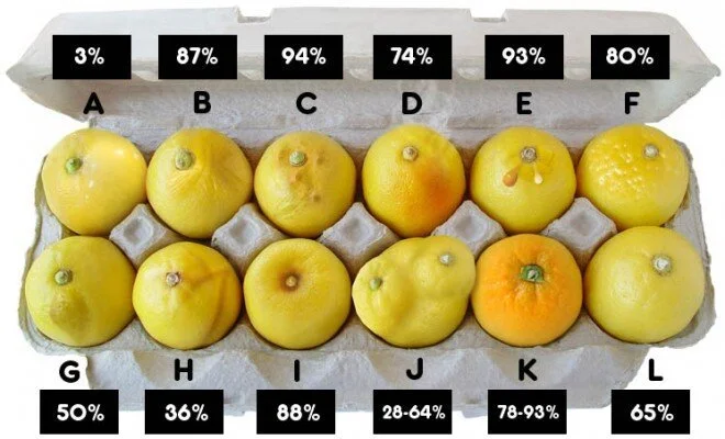
When the right visuals are used, we can communicate information in ways that text alone cannot. In the 12 signs of breast cancer image above, we can explain symptoms without becoming graphic. Instead of seeing a diseased breast with open wounds and turning away out of disgust, we instead see symptoms. Symptoms that make sense no matter what language you speak or what skin color you have. Visuals also educate incredibly quickly. In just seconds you can learn all 12 symptoms (it actually took longer for you to read this paragraph than to learn from the image to the left).

SOLUTION #2: LEMONS HAVE NIPPLES AND PORES, BUT ARE NOT BREASTS
By using a lemon as a stand-in for the breast, we can show detailed information and side-step all of the issues lead to censorship with breasts. It isn’t about limiting the body or changing the attitude of the entire world, it is about respecting the embarrassment and customs that many people have when it comes to displaying breasts, and the hesitation to touch themselves during self-exam. If we can untangle the breasts from sex when it comes to breast health by using a friendly and approachable message, we can accomplish a lot and fight for the right goal: saving lives through education.

SOLUTION #3: REDUCE FEAR
Cancer is a scary topic, that is often avoided. If the message is designed in a friendly way, that people can relate to, no matter their age, ethnicity or gender, we can educate with a tremendous impact. The female figure above is nearly universal. In Japan, she looks Japanese. In Columbia, she looks Columbian. In France, she looks French. In the Middle East, she looks Muslim. With a hair change, she’s African. Add a flower to her hair and she’s Samoan. We call her The Mayor, but it’s just one example of how good design can make a scary topic a friendly one.
What happens when our Know Your Lemons materials educate women?
Understanding a Lump
Patient Confidence
Patient Behavior
Read more about our study here.
In 2019, the Know Your Lemons Foundation (KYL) partnered with B-Force of Borstkankervereniging Nederland, a breast cancer patient association based in the Netherlands, to conduct a study among 1,407 breast cancer patients.

About 53% of women in the study were under the age of 50 (the age of eligibility for the Dutch mammography screening program).

When we compared the group of patients who had seen the Know Your Lemons campaign to the patients who had not, we found there was a 39% decrease in Stage 4 cancer diagnoses in women who had been educated by the Know Your Lemons campaign.
How were these materials developed?

This is an early version of the 12 signs visual (2005). The text labels were removed, and participants (n=67) were asked in an open-answer format to describe what the symptoms were that were being shown. These figures show which symptoms were communicating accurately and to what extent. The open-answer format led to images being adjusted as part of an iterative process that continues today.
Current version of the 12 signs of breast cancer image.Dr. Corrine Ellsworth-Beaumont is the designer behind the Know Your Lemons® campaign. She developed a “design thinking” process for understanding and testing solutions for breast cancer communication known as the U.S.E.R. Patient Centered Framework. It is a way of seeing problems from the patient’s perspective, and bringing patients into the development process. You can read more about this design thinking process here.
Self-Exam and Breast Anatomy Education
In a survey of 80 women, our initial findings were:
4% self-exam regularly
71% feel guilty for not doing it more often
44% wish they understood self-exams better
43% of us are the ones to discover a symptom so we need to find a better approach to self-exams. One way we help educate women about self-exam is to explain breast anatomy and what a cancerous lump can feel like by using objects they have already felt—a lemon seed, soft peas and soft beans:


Visualizing the patient pathway


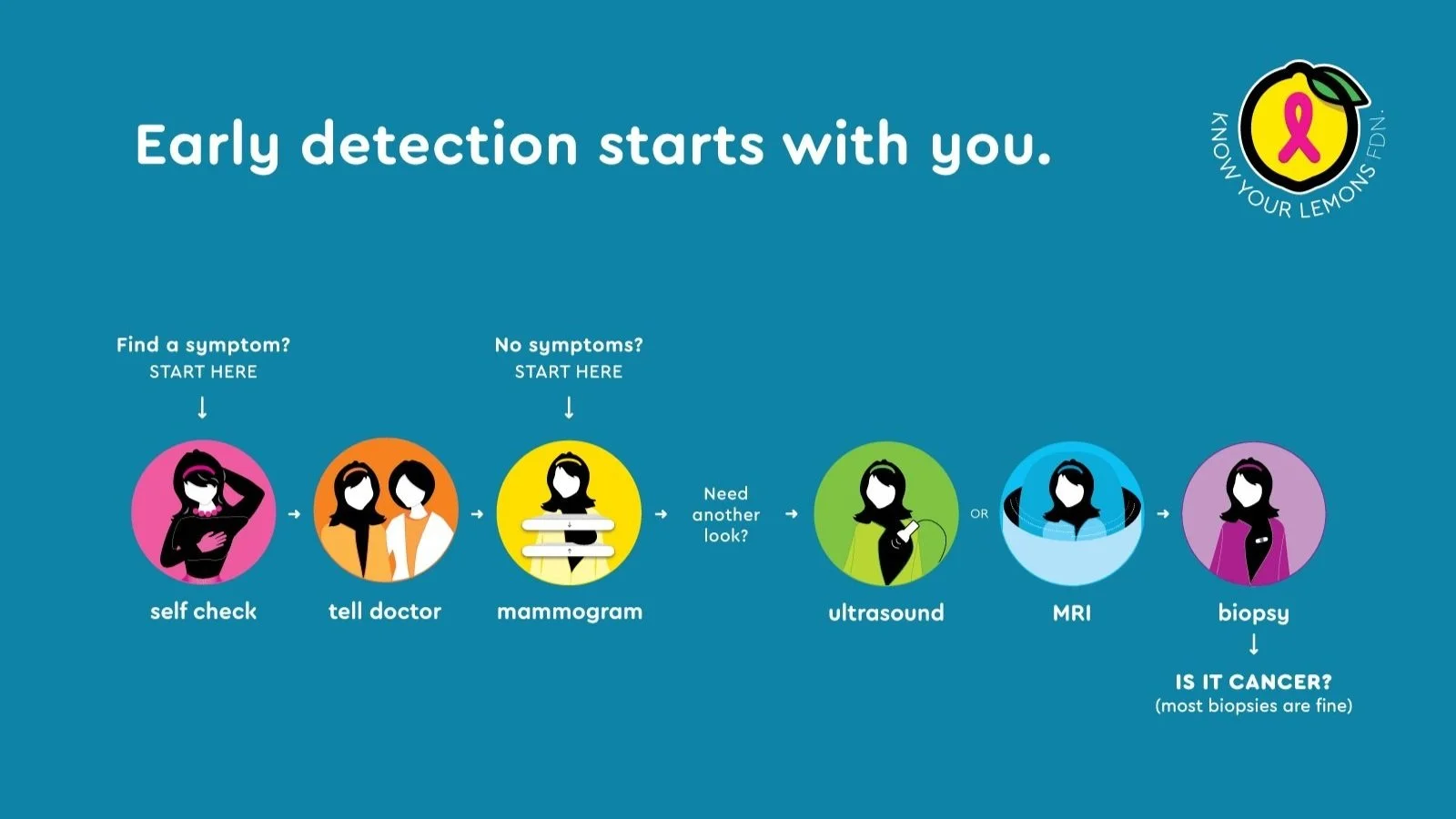
Visualize the steps of diagnosis, in such a way that they can picture themselves in the detection process. Instead of paragraphs of text with instructions, or complicated word charts with arrows pointing to different labels, we can show a woman going through the process step-by-step. By knowing the steps that are taken, patients are empowered to request testing where needed, and feel more in control as they are referred to different testing options. How do patients know what to expect if there’s no road map to see the way ahead?
Why are images important?
Words are usually the way that the public is educated about health messages. However, this is a problem for a few reasons:
It’s estimated that 1 in 5 patients have literacy issues (1), making reading difficult.
Most wordy educational materials are never read (Beaumont PhD, p. 249).
The information is in one language which is a problem for educating multicultural audiences.
Images can communicate to people of any language, are more engaging and can communicate information in a specific way that words cannot (imagine navigating a new town without a map, or building a house without blueprints). However, getting the right image can be difficult. And when most health materials are developed without designers, with limited budgets and lack of time, words are the easier way of communicating. In fact, in a review of over 100 breast cancer detection materials and websites, less than 10% of them used educational images at all. Despite this, 89% of patients prefer visual materials to non-graphic material.

The only materials that tell the whole story
In a comprehensive educational audit of over 100 breast cancer materials in print and online, no single resource provided all of the key information necessary for a patient to be fully aware of the detection process. Information like, “What does a lump feel like?” “What does breast cancer look like?” “What steps do I take to detect breast cancer?” were often not answered. By testing the message and materials with patients, it was possible to create a simple two-page leaflet that delivered these key messages in a single resource in a powerful and memorable way. The only one of its kind.
Tested with hundreds of patients
Most health materials are rarely tested with their audiences to determine if they work before the money is spent on printing. To make sure that the Know Your Lemons® Foundation materials were done right, several studies were done to get the visuals and the messages just right. Here are some results from those studies.
Designing began by doing a general survey of the public, to find where the gaps in education were and what the materials needed to inform the public about. Over 200 people took part in this survey.
It was found that half of patients didn’t know what a cancerous lump felt like. So a poster illustrating what the anatomy of a breast felt like was designed. This poster was tested alongside a traditional line drawing of anatomy which was common in education materials. The results were dramatic:

Interestingly, most people didn’t read the text in the second poster. Their knowledge was based mostly on looking at the images.
“Does seeing breast anatomy in this visual way improve your understanding
of what to feel for when you are doing a breast self-exam?”
97% said yes.
65% said it also made them feel more confident in their ability to recognize breast cancer.
It was also discovered that many people didn’t know that breast cancer could be presented in other ways besides a lump. A poster was designed to illustrate these signs. One study with 67 people looked at how accurately they could interpret the symptoms without any text. This would determine if this poster could communicate to more people across the world despite language differences.
Timeless, Universal Design
The woman figure, known as “The Mayor”, used to illustrate breast cancer events and act as a source of the friendly, approachable voice in the materials, is a unique concept and contribution in breast cancer detection materials to date. The Mayor has been found to be a relatable female image for most patients spanning across a range of nationalities as the campaign as been used in over 70 countries. When people were asked, “Could this woman be seen as someone from you country?” 98% of respondents, representing countries such as Columbia, USA, Britain, South Africa and the Middle East, said yes.
When tested with women in Qatar, one participate wrote: “I love the idea that the woman has no features and black hair, which could make her Indian, Pakistani, Asian or Arab.”
So why is this important? Often in materials, a woman is needed to illustrate a breast cancer event, such as getting a mammogram. If the materials are to be used in a variety of countries, it’s important for the reader to feel that the woman standing at the mammography machine is representing her, instead of representing a foreigner. If a patient makes a connection with the woman in the materials, they are more likely to visualize themselves participating in screening and seeing the information as being relevant to them, in their time. Here is an example of why using an illustrated figure is a benefit over using photographs:

Turn patient exams into teaching moments
These materials are designed to promote collaboration between patient and physician. Through using these materials developed by Know Your Lemons® Foundation in the health environment, patient–physician encounters can become teaching moments as well as diagnostic events. In particular, the risk assessment form allows a physician and patient to understand their risk while at the same time developing a screening plan. A copy can then be made for the patient chart that records the patient’s risk level and screening plan. The other copy is for the patient to take home as a reminder of that conversation.
Health practitioners can use these materials in each point of the patient journey to increase the effectiveness of screening and diagnostic events. Know Your Lemons® Foundation makes it easy to improve the patient experience through well-designed information. Get the materials here.
